In our last post on positioning, we discussed the different ways of arranging controls on a form. This time, we’re going to have a closer look at static positioning and how you can get your controls to the proper place on your form.
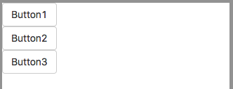
You might want to open a new project in AppStudio and play along. Start a new form with position set to static. Add three Bootstrap buttons:
Notice how they position themselves? They automatically go to the left side of the screen, below the previous button. Let’s see what ways we have to put them on the same line.
If we were using absolute positioning, we’d just move them into place. This is easy, but would not work well with different screen sizes.
If we were using relative positioning, we could move them by setting left and top for the buttons, or by adding float:left; to the style property. To start a new line of buttons, we would also add clear:left;. The problem with this strategy is screen size issues again, plus some inconsistencies in how HTML aligns different sized elements with respect to each other. Strange things could happen.
We use Buttons in this example, since they are simple and consistently sized. If we used a mix of different controls, with different sizes, the layout issues would get more complex. The principles would be the same.
For static positioning, we have a few choices. Let’s go through them, from worst to best.
1. Use display:inline-block;
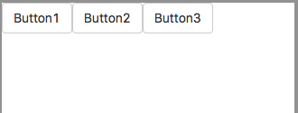
This is the easiest way to position controls horizontally. If we add display:block-inline; to the style property of each button, the screen looks like this:
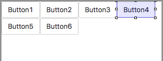
Looks good, doesn’t it? But there is a problem. If we want to make a second row of buttons, they can’t all have display:inline-block; they will add themselves to the first row:
There’s no easy way to force Button4 to start a new line. Let’s move to our next solution.
2. Use Containers
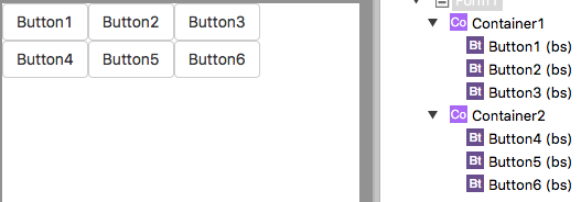
Add a couple of Containers. Drag Button1, Button2 and Button3 into the first one, and the rest into the other. Clear the content property in the Containers.
This looks good. The buttons are wrapped in Containers, which automatically position themselves one above the other. But it’s not a perfect solution. display:inline-block; works fine in simple cases, but will give sometimes surprising results with a jumble of different sized controls. Also, if you hide a control with display:inline-block; set, you will have to to do this when you show the control again:
Button1.style.display = "inline-block"
Let’s move on to the best solution.
3. Use Grids
Bootstrap includes a nice grid system for laying out your app. GridRows go across and act as containers for one or more GridColumns. Each GridColumn can contain one or more other controls (or even another grid!).
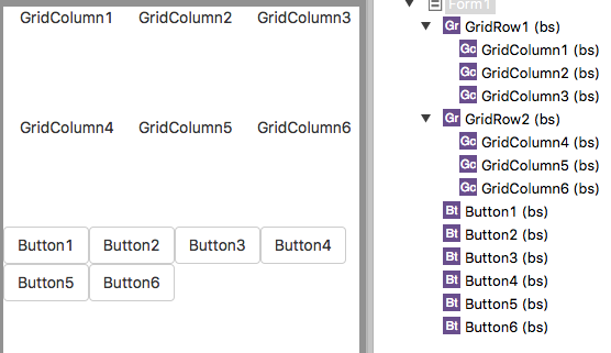
Let’s redo our example using Grids. Start by adding two GridRows. Into each one, add three GridColumns.
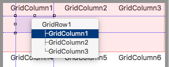
Now, drag each of the buttons into its corresponding GridColumn. When you drop, it lets you choose which container you want it to go into:
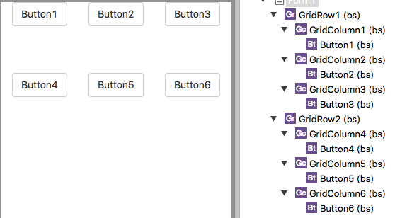
Here’s the completed grid:
The grid rows are spaced so wide vertically since their height is fixed at 100px for ease of use. Change the height of the GridRows and GridColumns to auto, and they will resize to fit the contents. Similarly, they are spaced widthwise since the column’s width is set to 100%, divided equally among the columns.
Grids will work with all controls except for jQuery Mobile. Since it doesn’t play well with Bootstrap, you’re probably better off using absolute or relative positioning with jQM.
Converting existing projects to static
Going from absolute to static can be a lot of work. You’ll need to group controls into Containers and use GridRows and GridColumns as needed. Use the margin properties to set space between controls.
Going from relative to static is easier. You’ll need to remove float:left and clear:left styles. Where you set left and top, copy those values into margin-left and margin-top. Then, using the strategies above, you can get all your controls back into the right spots.
