AppStudio 7.2.2 introduces the CSSGrid control, which provides a grid-based layout system, with rows and columns, making it easier to design web pages without having to use floats and positioning.
You can layout your form with areas, each of which can act as a container for the actual controls you will use. It’s a big help if you want to make a responsive layout.
There is reference documentation about it in the wiki – let’s walk through a tutorial of actually using it.
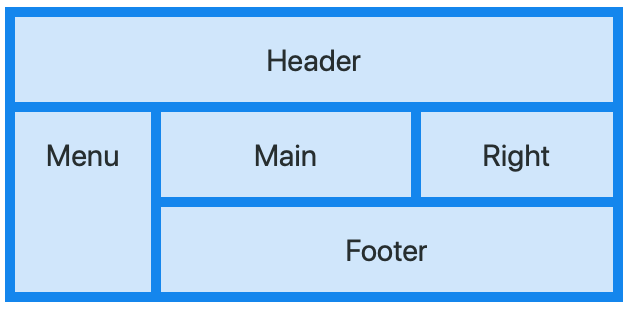
Support we want to layout a form like this:
This is actually how a lot of web pages are laid out. A Header at the top, a sidebar on the the left, some content in the middle and on the right, and a Footer at the bottom. For fun, we’re making a Footer which isn’t full width.
Each of these 5 areas will be defined by a child control to our Grid, using the new CSSGridItem control.
Let’s start by adding a CSSGrid control to a project and set some initial properties:
left: 10%
width: to 80%
backgroundColor: #2196F3
gridTemplateRows: set to blank
Next, let tell it how we want to layout the cells of the grid. We will divide the grid into 6 columns and 3 rows, and allocate them to the areas as follows:
header  header  header  header  header  header
menu    main    main    main    right   right
menu    footer  footer  footer  footer  footer
To tell our CSSGrid that this is our plan, we need to put this string into our CSSGrid’s gridTemplateAreas property:
gridTemplateAreas:
'header header header header header header' 'menu main main main right right' 'menu footer footer footer footer footer'
(Notice how each row is surrounded by single quotes, and that we do not put any line breaks in the string.)
Now, let’s add our first CSSGridItem control by dragging it from the toolbox onto the form. Then, drag it on top of CSSGrid1 so it becomes a child. There are a few properties to set as well:
CSSGrid1: content – set to blank
CSSGridItem1: content – set to Header
CSSGridItem1: gridArea – set to header
Add 4 more CSSGridItems. Set their content and gridArea values to
Menu menu
Main main
Right right
Footer footer
Notice that content is capitalized, while gridArea is all lower case. We could have made them the same, but we need to match what is in gridTemplateAreas.
You should now have something which looks like this. You can also refer to the CSSGrid sample which comes with AppStudio.
You can now drag Buttons, Title, input and other controls into the CSSGridItem containers. You can even put a Flexbox into a CSSGridItem.
NOTE
The CSSGrid will not appear properly in the Design Screen of AppStudio on Windows. The Design Screen uses IE11 to render images: IE11 does not handle the CSSGrid properly. If you run your app in Chrome, it will render properly. MacOS is fine.

