Styles are a powerful tool for shaping the appearance of your controls. To a large extent, AppStudio lets you avoid having to learn a lot about them: it just handles them for you. But if you want to do something special, it’s easy to add extra styling of your own.
The most common place to put a simple style rule is in the ‘style’ property of a control. This is very specific: it will only apply to that specific control. Where the concept of styles gets powerful is the ability to have style rules apply to groups of controls.
You should put all your rules into your project’s ‘Project CSS’, available on the Project meny. They will then be in one place and you can put them in the correct order.
The general format of a style rule is:
selector {style: value; …}
There are many possible ways to do selectors: here a few basic ones:
| selector | Elements affected |
|---|---|
| #Button1 | Rule affects just Button1 |
| * | Rule affects all controls |
| .myClass | Rule affects all controls which have class ‘myclass’ |
| input | Rule affects all controls which have an HTML element type of input. |
Here’s a reference with a more complete list of selectors.
You can have as many selectors as you like, and you can mix and match them. A single control could be styled by many rules, each with different types of selectors. They are processed in order for each control, with the last application rule having precedence. (Hence, the name Cascading Style Sheets).
For style, there are hundreds of possibilities, defining the color, size, font, positioning, highlighting and much more. HTML5 brings even more: animations, movement, fading.
Here’s a good reference to all the style attributes.
Let’s look at an example. NSB.ShowProgress displays a box which shows the progress of an operation:
The appearance of this box is defined by a list of style rules. There are quite a few of them, but most are straightforward:
  #NSB_Progress {
    z-index:9999;
    user-select:none;
    box-sizing:border-box;
    user-select:none;
    box-sizing:border-box;
    position:absolute;
    height:45px;
    left:55px;
    width:240px;
    font-size:15px;
    padding:12px 14px;
    text-align:left;
    font-family:helvetica;
    overflow: hidden;
    background: #ddd;
    background-image:gradient(linear,0 0,0 100%,
        color-stop(0,#fff),
        color-stop(0.02,#eee),
        color-stop(0.98,#ccc),
        color-stop(1,#a3a3a3));
    background-image:linear-gradient(to bottom,
        #fff 0%,#eee 2%,#ccc 98%,#a3a3a3 100%);
    border:1px solid #505050;
    border-radius:8px;
    background-clip:padding-box;
    border-radius:8px;
    background-clip:padding-box;
    color:#333;
    text-shadow:0 1px 0 rgba(255,255,255,0.75);
    line-height:130%;
    box-shadow:0 0 4px rgba(0,0,0,0.5);
    box-shadow:0 0 4px rgba(0,0,0,0.5);
}
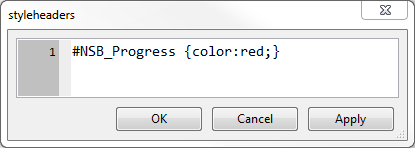
These are defined in the file asStyle.css, which is loaded early when your page is run. To change the color of the text to red, add this to your Project CSS:

Since the rules in Project CSS get processed last, the color overrides what is in asStyle.css. The result is this:
Tip: You can leave the Projects CSS window open while you are working on your app. Make a change to the rules and click on “Apply”. The appearance of the controls in your Design Screen will be updated.
