Vertical and horizontal centering is hard. Here, from CommitStrip.com:
Here’s a good resource with suggestions on vertical and horizontal centering:
https://css-tricks.com/centering-css-complete-guide/
Let’s work through an example.
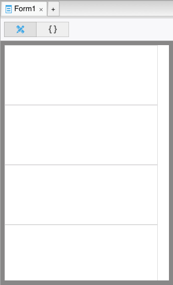
How about we make 4 buttons, equally spaced vertically on the form. Because we want to be responsive, we want the spacing to be based on the height of the screen. We can’t just space things using percentages we want the buttons to stay a fixed height even if the height of the form changes.
Start by putting 4 Containers on your form, each with a height of 25%.
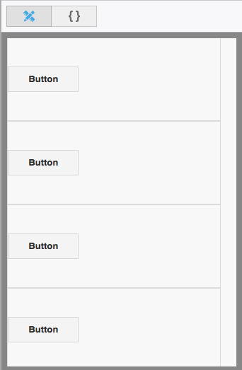
Add one Button to each Container, then center the buttons in the Containers vertically with this in the buttons’ Style property:
position: absolute;
top: 50%;
transform: translateY(-50%);
-webkit-transform: translateY(-50%);
margin: 0px;
This means:
| position:absolute | Don’t do relative positioning on the button. |
| top:50% | Put the top of the button 50% of the way down the Container. |
| transform:translateY(-50%) | Move the button up by half its height. |
| -webkit-transform:translateY(-50%) | Safari has its own name for this. |
| margin:0px; | The button control defaults to having a 6px margin around it. Change to 0 so it does not affect the position. |
Here’s how it looks:
If you stretch the height of the form, the Containers will stretch so they still each use a quarter of the height. The Buttons will remain centered in each Container.
To finish off, set the borderWidth of the Containers to 0, so the boxes around the Containers disappear.