When designing an app for mobile devices, you need to consider what happens if the device is rotated. You can just put up a message asked the user to rotate back, or you can design your app so it looks good in both portrait and landscape modes.
AppStudio 5 introduced Responsive Web Design as a way to layout your forms. RWD is a design approach for making apps size themselves to varying sizes of screens.
In this blog post, we’ll use Responsive Design to handle rotation in a simple layout with three buttons. The techniques can be used for much more complex layouts, of course.
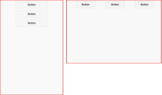
Here is how we want our app to look in each orientation:
In Portrait, we have 3 buttons in a vertical column. In Landscape, they show 3 across. When the screen is rotated, we want them to move to the other configuration – without having to add any code to our app.
1. Set your form’s position property to ‘relative’. This means the controls on the form will be positioned based on styling rules, rather than fixed positions. This is a key aspect of Responsive Web Design.
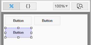
2. Add three Buttons to the Design Screen. They’ll position themselves starting from the top left, as many as will fit across before starting a new row:
3. Now, in Project Properties, open the styleHeaders property and enter the following:
@media (orientation:portrait) {
  #Button1 {margin-left:25%; width:51%;}
  #Button2 {margin-left:25%; width:51%;}
  #Button3 {margin-left:25%; width:51%;}
}
@media (orientation:landscape) {
  #Button1 {margin-left:10%; width:20%;}
  #Button2 {margin-left:10%; width:20%;}
  #Button3 {margin-left:10%; width:20%;}
}
For more about the styleHeader property, check this blog post.
Using the @media statement, you can make your style rules conditional. In this example, we have one set of rules for portrait and another for landscape. (The way it decides which one is simple: portrait is taller than it is wide.) There are other things you can do with the @media statement – it deserves its own blog post.
If the screen is portrait, we want to center the controls, one per row. By making the controls 51% of the width, it’s impossible for more than one button to fit across the screen. To center the controls, we need to put half the remaining space (49%) as a margin on the left of the control, hence margin-left:25%;.
If the screen is landscape, we want all the controls on the same row. If we give each button 20%, we will have 40% left over with 3 buttons. We can then put 10% margin between the buttons to end up with 100%.
3. We’re done. Run the app in your browser. Change the size of the browser screen and you will see the size and position of the buttons adjust automatically. A good way to test is to use the Chrome Debugger’s Device tab. You can select different device sizes and rotate them to see how your app responds.
4. Could we do this more efficiently? Yes – here’s how. Add ‘rwdButton’ to each button’s class property and put this in styleHeaders:
@media (orientation:portrait) {
  .rwdButton {margin-left:25%; width:51%;}
}
@media (orientation:landscape) {
  .rwdButton {margin-left:10%; width:20%;}
}
Now, rather than giving style rules for each button, we apply the style rules to all controls which have the rwdButton class.
Conclusion
Responsive Web Design can be used to create apps which adjust automatically to different screen sizes, without needing any code to watch for changes in screen size or explicit calculations. If you design your apps properly, they will look great even on screen sizes that haven’t even been built yet.
Check out the ResponsiveRotation sample to try this out.

