One of the new controls in AppStudio 5 is the Container. It has a couple of uses: you can create your own controls with it, or you can use it as a container for other controls. We’ll deal with the first use in this article.
First, a bit of background. Late in Version 4, we introduced a new Generic control. We realized that a lot more could be done with it, so for Version 5 we enhanced it and renamed it Container.
Any page of HTML is made up of Elements. The specifications for HTML define a few dozen Elements. Examples are Paragraph (“<p>”), Input (“<input>”) and Button (“<button>”). Each of these has a whole bunch of parameters, grouped by Classes, Attributes and Styles.
Controls (also called Widgets) are structures made up of one or more Elements, with their parameters defined to provide a particular appearance or behaviour.
What AppStudio essentially does is create fancy HTML pages by making it easy to set up these Controls, then let you use them in your program. The Container gives you a control with complete control over its appearance.
A few notes:
- Events can be added to a Container control just as with any other control.
- Reuse Containers by copying and pasting them.
- The Content property can be text or HTML. Text will appear as normal, but HTML can be styled text or even HTML elements.
Let’s make couple of examples.
First, let’s make our own, lightweight header bar:
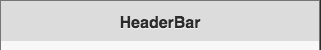
Here is how the properties look:
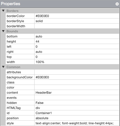
- The HTMLTag is <div>. A DIV is a simple HTML element which can contain text or other HTML elements.
- No class or attributes need to be set – it’s a simple control.
- Background color is set to a neutral gray.
- Style is set for bold font, centered in the box.
Next, let’s make a fancy button:
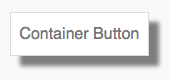
Here is how the properties look:
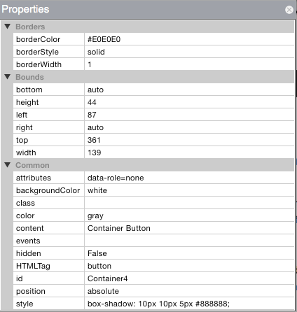
- The HTMLTag is <button>. This will create a control which looks like a button.
- In Style, we put a fancy shadow using the box-shadow Style.
- In Attributes, we put
data-role=none. This prevents jQuery Mobile’s classes from overriding our own styling. - We leave Class blank – but we could specify a class and use Advanced Styling so all your buttons have a similar appearance and you only have to set the styling once.
One Reply to “Container, Part 1: Make your own control”
Comments are closed.