Want to test how your app will look without have to download to a device? Recent enhancements to Chrome make this possible. Now it’s easy to watch the affect of different screen sizes and rotation on your app – all within the Chrome Debugger.
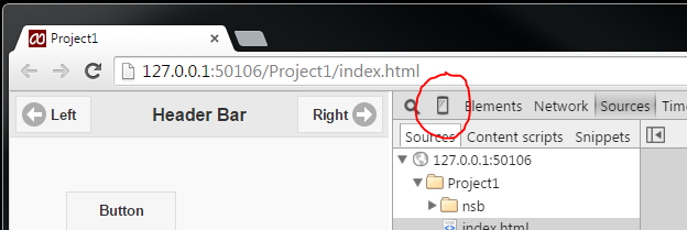
Run your app locally as usual. It will get started in Chrome. Open the Chrome Debugger by hitting F12 (option-command-J on Mac). See the phone shaped icon in the tab bar?
Click on it, and your app will be displayed in a mock device screen. You may need to do a refresh so it appears properly:
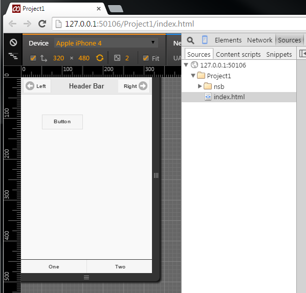
There are several options for testing:
- Standard Device Sizes
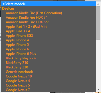
Dimensions for many popular devices appear. Select one and your app will be rendered in that device’s size. - Custom sizes

You can also specify a size of your own. - Rotate

Rotate the screen, keeping the same dimensions. - Use the Drag handles
You can also use the drag handles to go to a new size. This is especially useful for testing Responsive Design, since you can see how the layout changes through all possible sizes.
When you run your program again, the Chrome Debugger will remember your settings so you don’t need to initialize everything again.
There are also advanced features to allow you to test gestures and other effect. Google has complete documentation on this feature.